Sempre Giovine Skin Cleanser

“Sempre Giovine – Pronounced Sem-pray Jo-ve-nay
Meaning Always Young”

Sempre Giovine ad from 1913

Sempre Giovine ad from 1913

Sempre Giovine is one of those products whose ads you are well acquainted with if you spend any time at all looking through old magazines. This particular ad was found in my copy of the September 1913 issue of Ladies’ Home Journal, but similar ads were found all over 100 years ago. Despite this, I never knew much about the product other than that it looked to be a cake of soap.

You will notice that in this ad, a beautiful young woman named Violet MacMillan is quoted as saying “It’s so easy to use Sempre” while she holds the product up to her face. Violet MacMillan was a vaudeville and silent movie actress who was born in Grand Rapids, Michigan. Grand Rapids also happens to be the place where Sempre Giovine began, and its story is an interesting one. I found it on the History of Grand Rapids website, where the Grand Rapids Historical Commission explains:

Nora Carr and Nora Husted, a mother and daughter team, founded a Grand Rapids cosmetics business that lasted over 50 years. In 1886, shortly after Nora Husted and her first husband had divorced, she moved to Grand Rapids from Lowell, Michigan. To earn money and care for her five children she opened a boarding house. To bring in more income, she began to make face cream in her kitchen using an old family recipe. With the help of her children, she sold her products door to door. Later, after marrying James Carr, she sold the boarding house, but kept her business.

The company that Carr founded was called the Marietta-Stanley Company, which you’ll also see listed at the bottom of this ad.

As far as what Sempre Giovine actually is, all that this ad tells us is that “Sem-pre is a product peculiar to itself, distinctly different from other toilet preparations.” In search of more information, I ended up locating the June 7, 1912 edition of the Pittsburgh Press newspaper which has another description:

“This celebrated ‘Little Pink Cake’ is not a soap, cosmetic, cold cream, massage cream or balm. It stands alone as the most marvelous skin cleanser and ‘Youth Restorer’ known to science. A harmonious blend of natural oils, it does not cause hair to grown on the face. It is made by the MARIETTA STANLEY CO. of Grand Rapics, Mich., from a formula used by beautiful women for several generations.”

In 1913 when this ad appeared, the price of a cake of Sempre Giovine was fifty cents.

{ 0 comments }

Vintage Home Decor from 1920

“A box-shaped house, such as the one advocated on this page, is always most economical of space. You can get more wall space, more room space, more actual ‘overhead’ than in a house that is oddly shaped.”

How to furnish a brick home. Tips from 1920.

The April 1920 issue of the Delineator magazine features an article called “A Small Brick House.” It discusses the internal and outdoor decor of such a home, and here we can see the sketches of the outside of the house:

How to furnish a brick home. Tips from 1920.

The article points out some of the benefits of living in a brick house:

“Think carefully, too, of the advantages of a brick house. Such a house is warm in Winter and cool in Summer. The initial cost may be a little larger than for a house built of wood but, in the long run, the economy effected by the brick house offsets this higher expense.

“For instance, the brick house does not need to be painted. Considering the high cost of both labor and paint, this is a real saving. Nor is the insurance rate so high, for the brick house is practically indestructible and therefore not in great danger from fire. The fact, too, that it is warmer in Winter, not only means added comfort but actually reduces the coal bills.”

Then the article moves into the inside portion of the house, and provides some ideas on how to decorate and furnish it. In the illustration at the top of this entry, we see the home’s living room. Here is a description of how that room has been decorated:

“In the living-room at the top of the page the furniture is treated in enameled ivory to give a restful effect of space.
Formal window draperies of old-blue velours, draw-curtains of a darker tone and glass-curtains of a light transparent material. Seat of Napoleonic influence in blue taffeta; woodwork, ivory white.
Oval table and end-tables in ivory with enameled green tops under glass. Stuffed chairs in blue and light gray: buff paneled walls and a black waxed floor.”

Now, we’ll move on to the bedroom:

How to furnish a brick home. Tips from 1920.

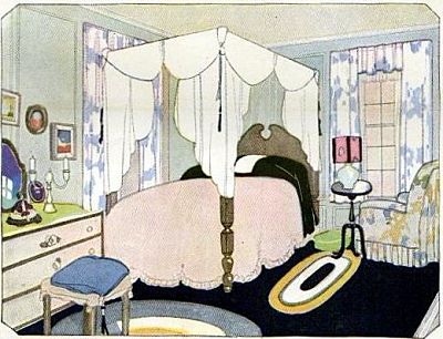
“Woodwork of the bed, French walnut; dresser in white enamel outlined in walnut. Black carpet and two hand-made oval rugs.
Window-hangings and stuffed chairs are a light flowered chintz. Paneled walls finished in light silver-gray.”

And lastly, the dining room/staircase:

How to furnish a brick home. Tips from 1920.

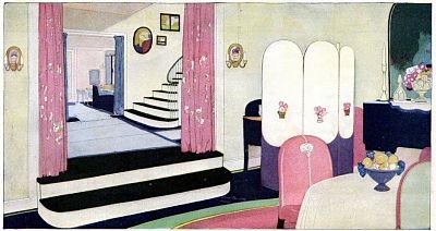
“Dining-room with black waxed floor and a plain carpeted mouse-colored rug – a striking contrast to the delicate buff finish of the paneled walls. Stairway has arrangement of pictures with brilliant color notes. Rug, hangings and upholstered chairs of a wisteria tone. Over the sideboard a decoration in somber wood.”

I really like the style of decor used in these rooms. The black accents are always a favorite of mine and I see them often in rooms from the late teens to early 1920′s. Here, I especially like how they are played off against bold but feminine shades of pink, blue, and chartreuse.

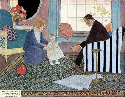
In this same April 1920 magazine issue, I found another ad where the home decor really caught my eye. It was in an ad for Congoleum Gold-Seal Art Rugs, and so many things about it look rather modern – the striped black and white chair, the leopard-patterned pillow, the bold colors of the flowers together in the vase. Here is a close-up of the interior of the room shown:

Interior home decor as seen in a vintage Congoleum ad from 1920.

Below are thumbnails showing the entire pages as they appeared in the magazine.

1920 Home Decor ideas.Vintage ad for Congoleum Gold Seal Art Rugs from 1920.

{ 0 comments }

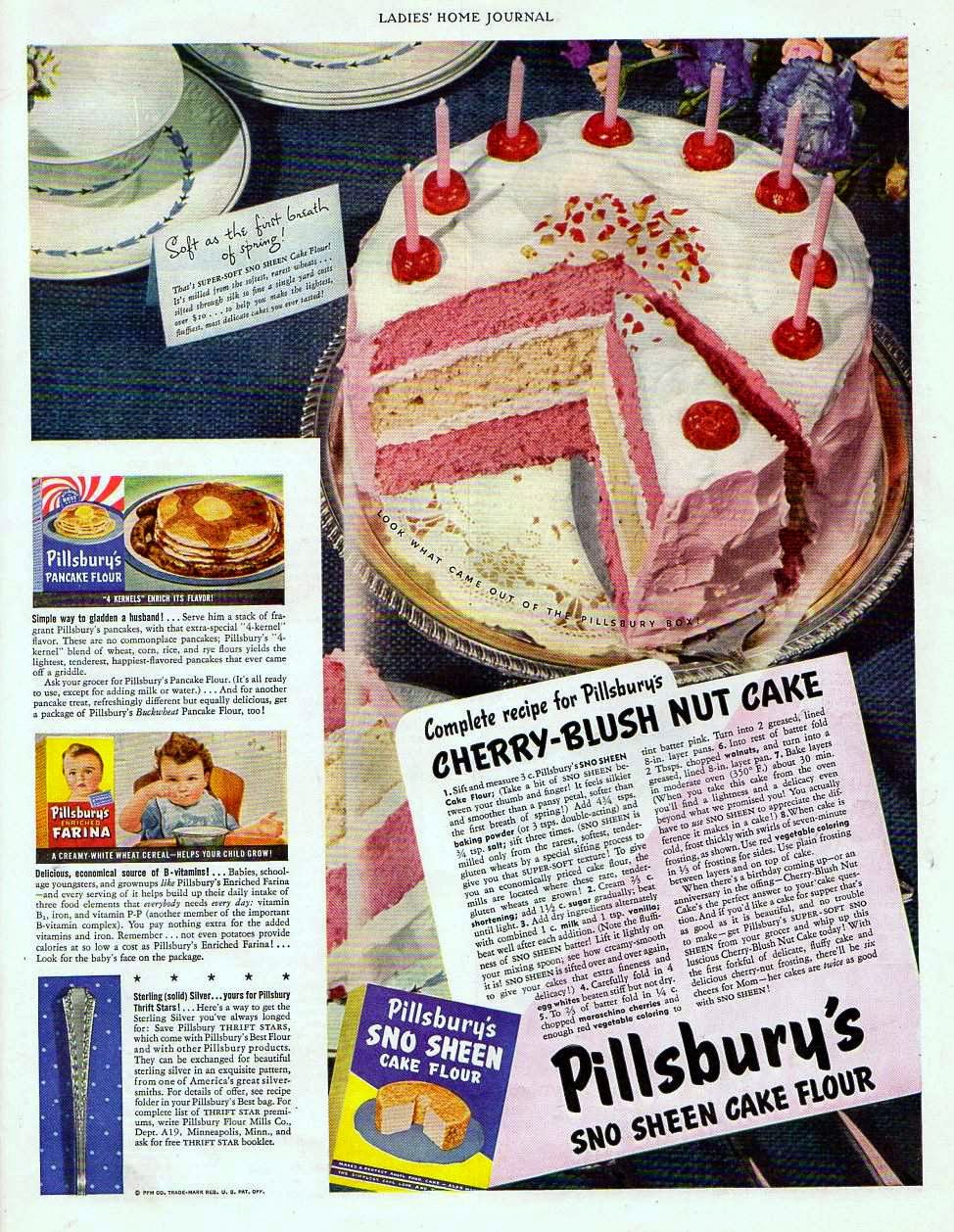
Pillsbury’s Cherry-Blush Nut Cake, 1942

“When there’s a birthday coming up – or an anniversary in the offing – Cherry-Blush Nut Cake’s the perfect answer to your cake question. And if you’d like a cake for supper that’s as good as it is beautiful, and no trouble to make – get Pillsbury’s SUPER-SOFT SNO SHEEN from your grocer and whip up this luscious Cherry-Blush Nut Cake today! With the first forkful of delicate, fluffy cake and delicious cherry-nut frosting, there’ll be six cheers for Mom – her cakes are twice as good with SNO SHEEN!”

Pillsbury's Cherry Blush Nut cake vintage recipe from 1942.

From the April 1942 issue of The Ladies Home Journal magazine comes this Pillsbury recipe for “Cherry-Blush Nut Cake.”

The recipe is found in an ad for Pillsbury’s Sno Sheen Cake Flour, which the ad explains is “milled from the softest, rarest wheats… sifted through silk so fine a single yard costs over $10… to help you make the lightest, fluffiest, most delicious cakes you ever tasted!” The ad describes the flour in rapturous language throughout, calling it “soft as the first breath of spring,” and “silkier and smoother than a pansy petal.” In transcribing the recipe itself, I also had to leave out long sentences praising Sno Sheen that were inserted into the steps, sentences such as “Note the fluffiness of SNO SHEEN batter! Lift it lightly on your mixing spoon; see how creamy-smooth it is! SNO SHEEN is sifted over and over again, to give your cakes that extra fineness and delicacy!”

I was happy to see that the recipe appears twice as long as it really is due to this excess of language.

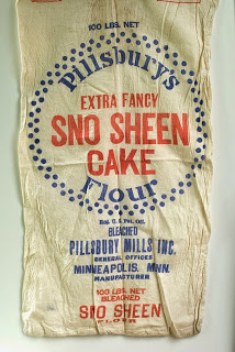
A bag of Sno Sheen Flour.

Before I get to the actual recipe, I would like to note that it calls for seven-minute frosting. This is a very common type of frosting to make that has been around for ages and which is often called for in my vintage magazines where it seems no recipe is considered necessary. A quick Google search leads to hundreds of recipes. I found a good recipe on the King Arthur Flour Site, which also states that “Seven minute frosting has been around since the early 1900s, and probably before that. Pastry chefs know this type of frosting as a Swiss Meringue. To make the unique texture this frosting is known for, egg whites and sugar are combined and beaten over simmering water, to dissolve the sugar and achieve a very light, fluffy texture. The frosting must be used promptly, because it firms up as it sits and cools.”

And without further ado, here is the cake recipe (which I am sure could be made even without the wonders of SNO SHEEN flour, although I do wish I could try it that way!)

Pillsbury’s Cherry-Blush Nut Cake, from 1942

1. Sift and measure 3 c. Pillsbury’s SNO SHEEN Cake Flour. Add 4 3/4 tsps. baking powder (or 3 tsps. double-acting) and 3/4 tsp salt; sift three times.

2. Cream 2/3 c. shortening; add 1 1/2 c. sugar gradually; beat until light.

3. Add dry ingredients alternately with combined 1 c. milk and 1 tsp. vanilla; beat well after each addition.

4. Carefully fold in 4 egg whites beaten stiff but not dry.

5. To 2/3 of batter fold in 1/4 c. chopped maraschino cherries and enough red vegetable coloring to tint batter pink. Turn into 2 greased, lined 8-in. layer pans.

6. Into rest of batter fold 2 Tbsps. chopped walnuts, and turn into a greased, lined 8-in. layer pan.

7. Bake layers in moderate oven (350 degrees F.) about 30 min.

8. When cake is cold, frost thickly with swirls of seven-minute frosting, as shown. Use red vegetable coloring in 1/3 of frosting for sides. Use plain frosting between layers and on top of cake.

{ 1 comment }

Electrical Housekeeping, 1920

Vintage ads and advice on buying a vacuum cleaner, from 1920.

1920 Rules for Choosing a Vacuum Cleaner

“I often say that it seems almost as if this Western Electric Vacuum Cleaner had been designed by a woman, so carefully have those little points that only a woman would think of, been taken care of.
“But don’t think that the ‘man mechanics’ that mean proper engineering construction have been left out.
“Most women aren’t interested in machinery, as machinery (I know I’m not), but most men are. And that’s why I say again, ‘take a man along’ when you choose your cleaner.’”

This “helpful” advice was found in a full-page ad from the Western Electric Company, in the April 1920 issue of the Delineator magazine. The title of the ad (which is meant to read and look like an actual magazine article) is “Electrical Housekeeping – a department for homemakers. Edited by Mrs. June Strickland. Published and copyrighted by Western Electric Company”.

Vintage ads and advice on buying a vacuum cleaner, from 1920.

“Mrs. Strickland” apparently “spends a part of each day in a big New York Department store helping women to choose electrical appliances for the home. She believes that most women overlook the really important points because so few women have a knowledge of mechanics.” This text-filled ad also discusses details about the motor driven brush, the dust bag, suction power, and durability (presumably in a way even women can understand!)

This was far from the only ad for electric vacuum cleaners in this issue, however. And some of the ads are strikingly beautiful.

Vintage ads and advice on buying a vacuum cleaner, from 1920.

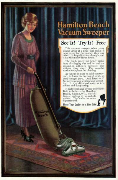
This is an ad for the Hamilton Beach Vacuum Cleaner, and shows a woman in a pretty purple dress effortlessly cleaning the rug (it looks like she even has her hand on her hip). So the vacuum must be very easy to use. The ad also mentions again the “motor-driven brush” that we heard about above in the Western Electric Company ad:

“This vacuum sweeper offers every cleaner virtue at a price that makes it more value for the money than any other. It is quality clear through, and it has the motor-driven brush.”

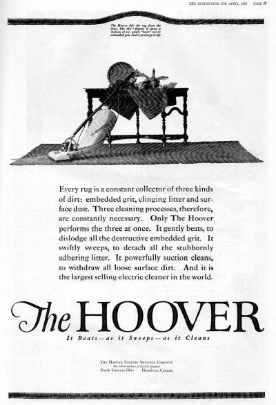
Next, we move on to another name that is still familiar to us today, the Hoover.

Vintage ads and advice on buying a vacuum cleaner, from 1920.

“Every rug is a constant collector of three kinds of dirt: embedded grit, clinging litter and surface dust. Three cleaning processes, therefore, are constantly necessary. Only The Hoover performs the three at once.”

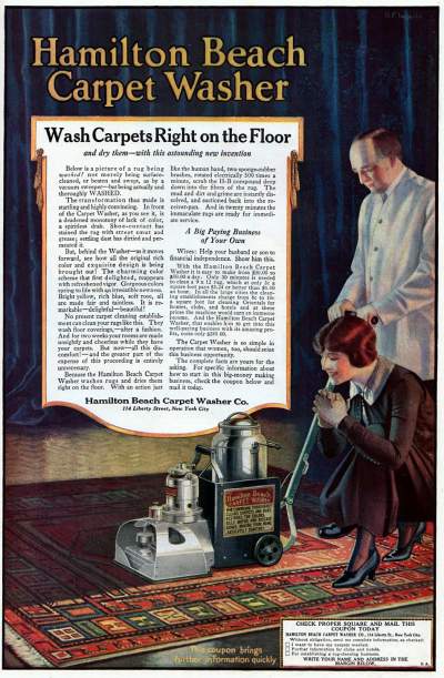
Finally, we return back to Hamilton Beach for a final ad. This one is for the Hamilton Beach Carpet Washer.

Vintage ads and advice on buying a vacuum cleaner, from 1920.

This washer went way beyond what a mere vacuum cleaner could do:

“Below is a picture of a rug being washed! not merely being surface-cleaned, or beaten and swept, as by a vacuum sweeper – but being actually and thoroughly WASHED.”

Interestingly enough, we also return to a theme from the Western Electric ad at the top of this entry: the need for the man to get involved. In this case, though, the Hamilton Beach carpet washer was positioned as a great business opportunity – all you had to do was clean other’s carpets using the washer that you purchased – and it was possible to make from $30 to $50 dollars a day. The woman reading the ad was urged:

“Wives: Help your husband or son to financial independence. Show him this.”

Although truthfully, the ad goes on to advise:

“The Carpet Washer is so simple in operation that women, too, should seize this business opportunity.”

Regardless of how dated many of the ideas in these ads may be, it is important to realize that these appliances actually did help to change the quality of life for many women. The proportion of time spent cleaning the rugs and floors, as well as the ease as compared to previous methods of cleaning, must have made a big difference especially when combined with other electronic inventions of the time. For a look at some other vintage appliance ads, you can look at this section of the website.

{ 0 comments }

1906 Fashions in New York vs. Paris

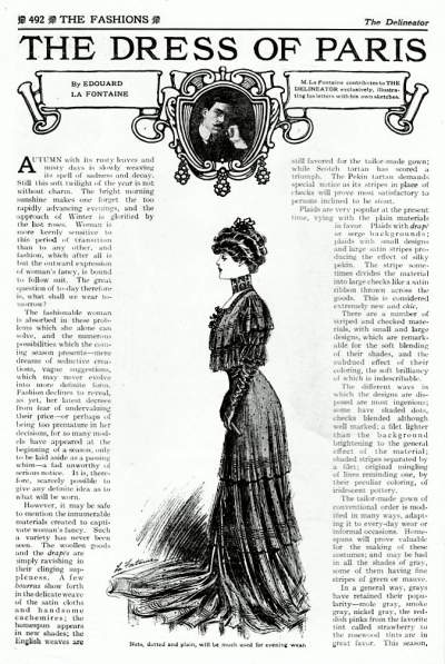
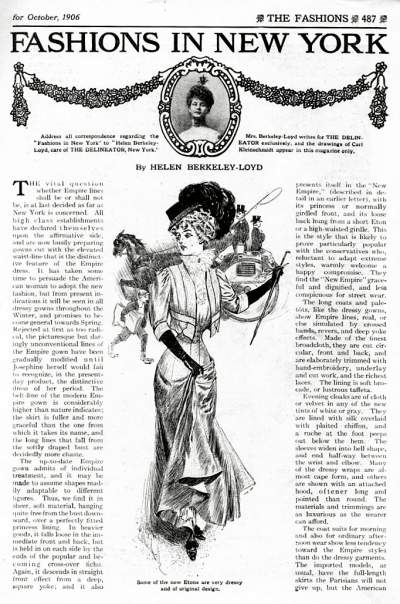
The October 1906 issue of the Delineator magazine presents us with two separate articles; one is called “The Dress of Paris,” written and illustrated by Edouard La Fontaine, and the other is “Fashions in New York,” written by Helen Berkeley-Loyd with drawings by Carl Kleinschmidt. In this entry, I’ll present them both so you can see the differences and similarities first-hand from people who actually lived surrounded by these fashions.


Differences in fashions in Paris vs. New York City in 1906.

“Nets, dotted and plain, will be much used for evening wear.”


The Dress of Paris

The beginning of this article on the styles of Paris brings to us a bit of the melancholy and beauty that we often associate with a distant Paris of the past. However, after a rather wistful introduction, the author turns to more factual bits of information on what the fashionable Parisian of his day was wearing. It seems that plaid was extremely popular:

“Plaids are very popular at the present time, vying with the plain materials in favor. Plaids with drape or serge backgrounds; plaids with small designs and large satin stripes producing the effect of silky pekin. The stripe sometimes divides the material into large checks like a satin ribbon thrown across the goods. This is considered extremely new and chic.”

As far as popular colors, all types of gray tints were still to be seen:

“In a general way, grays have retained their popularity – mole gray, smoke gray, nickel gray, the reddish pinks from the favorite tint called strawberry to the rosewood tints are in great favor.”

Now, let us cross the ocean and turn to New York City.

Differences in fashions in Paris vs. New York City in 1906.

Some of the new Etons are very dressy and of original design.


Fashions in New York

Here in New York City, we get right to the fashion talk. One of the things we find is that the gray colors so beloved in Paris are found here in New York, too, although it seems they are especially popular in evening wear:

“Evening cloaks are of cloth or velvet in any of the new tints of white or gray. They are lined with silk overlaid with plaited chiffon, and a ruche at the foot peeps out below the hem. The sleeves widen into bell shape, and end half-way between the wrist and elbow.”

Besides that, however, the Empire silhouette sounds like it was quite the thing that year.

“The vital question whether Empire lines shall be or shall not be, is at last decided as far as New York is concerned. All high class establishments have declared themselves upon the affirmative side, and are now busily preparing gowns cut with the elevated waist-line that is the distinctive feature of the Empire dress… Rejected at first as too radical, the picturesque but daringly unconventional lines of the Empire gown have been gradually modified until Josephine herself would fail to recognize, in the present-day product, the distinctive dress of her period.”

You may of course click on the articles scanned above to read in more detail about the styles of that year.

{ 0 comments }

Like Opium Eaters, 1900

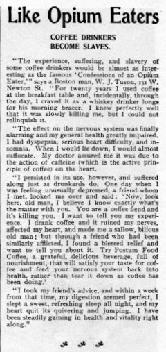
Talk about an ad that gets your attention! I was looking through the November, 1900 issue of the Delineator magazine, reading back to front as I tend to do, when I noticed this headline on the side of one of the last pages full of ads:

Like Opium Eaters


Of course I had to read the rest of it immediately, and it continued: COFFEE DRINKERS BECOME SLAVES.

It turned out to be an ad for Postum Coffee Food, but the writing in this one is so good and so dramatic that it is definitely worth reading. Here is the ad in full, and under that I will transcribe it since the copy might be a little difficult to read.

A vintage ad that states "Like Opium Eaters, Coffee Drinkers become slaves."

“The experience, suffering, and slavery of some coffee drinkers would be almost as interesting as the famous ‘Confessions of an Opium Eater,” says a Boston man, W.J. Tuson, 131 W. Newton St. “For twenty years I used coffee at the breakfast table and, incidentally, through the day, I craved it as a whiskey drinker longs for his morning bracer. I knew perfectly well that it was slowly killing me, but I could not relinquish it.

“The effect on the nervous system was finally alarming and my general health greatly impaired. I had dyspepsia, serious heart difficulty, and insomnia. When I would lie down, I would almost suffocate. My doctor assured me it was due to the action of caffeine (which is the active principle of coffee) on the heart.

“I persisted in its use, however, and suffered along just as drunkards do. One day when I was feeling unusually depressed, a friend whom I met, looked me over and said: ‘Now, look here, old man, I believe I know exactly what’s the matter with you. You are a coffee fiend and it’s killing you. I want to tell you my experience. I drank coffee and it ruined my nerves, affected my heart, and made me a sallow, bilious old man; but through a friend who had been similarly afflicted, I found a blessed relief and want to tell you about it. Try Postum Food Coffee, a grateful, delicious beverage, full of nourishment, that will satisfy your taste for coffee and feed your nervous system back into health, rather than tear it down as coffee has been doing.’

“I took my friend’s advice, and within a week from that time, my digestion seemed perfect, I slept a sweet, refreshing sleep all night, and my heart quit its quivering and jumping. I have been steadily gaining in health and vitality right along.”

{ 0 comments }

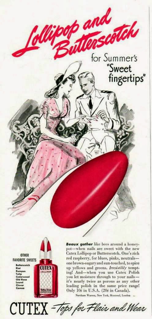
Cutex ads are found all through the pages of my vintage magazines. The company produced the first nail tints in 1914, and the first liquid nail polish in 1917, and from those early years all the way up through my 1950′s magazines Cutex ads are plentiful. I’m rather happy about that, because their old ads tend to be some of my favorites.

A pretty vintage ad from 1941 for Cutex Nail Polish.

In this ad from the July 1941 issue of Mademoiselle magazine, we are informed of the “Sweet Fingertips” collection. The ad lists all the available nail polish shades (or “favorite sweets”) in this collection:

Butterscotch
Riot
Rumpus
Tulip
Cedarwood
Old Rose
Laurel
Clever
Cameo

The ad also states that:

“Beaux gather like bees around a honeypot – when nails are sweet with the new Cutex Lollipop or Butterscotch. One’s rich red raspberry, for blues, pinks, neutrals – one brown-sugary and sun-touched, to spice up yellows and greens.”

As in the above excerpt, Cutex ads often tended to tell the reader which shades would work best with certain colors of clothing. In an older entry on this blog, you can see another Cutex ad from 1933 which goes into more details about color matching.

At the time of this ad, in 1941, Cutex nail polish cost ten cents in the United States, and 20 cents in Canada.

The slogan was “Cutex – Tops for Flair and Wear.”

{ 0 comments }

Libby’s Canned Foods, 1922

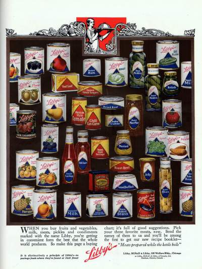
“When you buy fruits and vegetables, milk, meats, pickles and condiments marked with the name Libby, you’re getting in convenient form the best that the whole world produces. So make this page a buying chart; it’s full of good suggestions.”

An ad from 1922 that shows a collection of canned Libby's products from the 1920's

This ad is full of so much information that it’s hard to see everything! It is a Libby’s ad from 1922, and features an illustration of a huge variety of canned goods.

I found cans of all of the following, believe it or not: peaches, ripe olives, apple butter, deviled ham, kraut, sour pickles, dill pickles, plums, veal loaf, cooked lunch tongues, sweet pickles, relish, evaporated milk, asparagus tips, loganberries, Bartlett pears, Mexican style tamales, chili con carne, bouillon cubes, dried beef, moist mincemeat, tomatoes, blackberry jam, cherries, apricot, tomato catchup, chili sauce, Vienna style sausage, mustard, roast beef, spinach, sweet potatoes, jelly, corned beef, corned beef hash, green olives, oven baked beans, Hawaiian pineapple, yellow Cling Peaches, and red Alaskan salmon!

I always like looking at the packaging of old vintage products, and that’s one reason this ad is so interesting to me. I also admit that I didn’t realize the extent of choices consumers had in the 1920′s.

If you notice, there was an offer attached to this ad also –

Pick your three favorite meats, now. Send the names of them to us and you’ll be among the first to get our new recipe booklet – “Meats prepared while the kettle boils”

I hope you enjoyed the almost hundred year old ad as much as I did.

“It is distinctively a principle of Libby’s – to package foods where they’re found at their finest”

{ 0 comments }

Tomatoes Stuffed with Avocado, 1950

A vintage 1950 recipe for tomatoes stuffed with avocado

Corn on the cob, scalloped chicken, avocado stuffed tomatoes, and hot fried bread

“Corn on the cob is one of America’s great inventions, completely native to this continent and one of the world’s most delectable viands. Unfortunately, it isn’t easy to serve and eat with the usual assortment of meat and vegetables, so we have a tendency to play it down in our dinner-party menus. But I like to treat it with respect, give it a course all to itself, and a first course at that – it deserves top billing.”

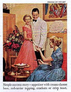
So begins this article, Conversation Piece, by Ruth Mills Teague, in the August 1950 issue of Ladies’ Home Journal. Because the author loves fresh corn on the cob so much, she sets out to play up its appeal by creating an entire menu to revolve around the corn and “satisfy her corn loving friends.” From the way the author describes it, it sounds like an informal, light meal and yet I love how in true 1950′s style the guests arrive in dresses and bow ties with jackets, and caviar is served.

A vintage 1950 recipe for tomatoes stuffed with avocado

“We’re here for the corn.”

Ms. Teague then goes on to describe each of the various parts of her dinner.

“For a simple appetizer we’ll have a spread with a cream-cheese base… A great favorite of our is cream cheese combined with finely chopped onion and topped with red caviar.”

“After the corn on the cob, which is a hearty first course, we’ll want the rest of the meal to be on the light side. So for the meat dish I’ve chosen scalloped chicken.”

“The salad, tomatoes stuffed with marinated avocado – and a wonderful salad this is, especially now when tomatoes are at their peak.”

“Since this isn’t a too ambitious meal so far as cooking is concerned, I’m going to give you a recipe for fried bread. You simply mix up a batch of dough, let it rise twice, pinch off small pieces and fry them in deep fat.”

“For a light, refreshing dessert we’ll have grape Bavarian icebox pudding. It can be molded or it can be heaped in the compotes in which it will be served and stored in the refrigerator to set.”

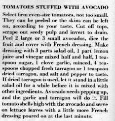
Because I am probably as much a fan of avocado as the author is of corn, I decided to feature the recipe for Tomatoes Stuffed with Avocado here. What I noted right away is what a different view of avocados was taken in this 1950 recipe. Today is seems that we usually tend to focus on the luxurious taste of the avocado itself, rather than cover it up with heavy ingredients. Yet here the author deems it necessary to marinate it in a French dressing, because “avocado needs pepping up, and the garlic and tarragon will do it.” I did notice though that the marinade is actually more like a French vinaigrette than the creamy, ketchup based dressing this can also refer to today.

A vintage 1950 recipe for tomatoes stuffed with avocado

TOMATOES STUFFED WITH AVOCADO

Select from even-size tomatoes, not too small. They can be peeled or the skins can be left on, according to your taste. Cut off tops, scrape out seedy pulp and invert to drain. Peel 2 large or 3 small avocados, dice the fruit and cover with French dressing. Make dressing with 3 parts salad oil, 1 part lemon juice and vinegar mixed half and half, 1 teaspoon sugar, 1 clove garlic, minced, 4 teaspoons chopped fresh tarragon or 1 teaspoon dried tarragon, and salt and pepper to taste. If dried tarragon is used, let it stand in a little salad oil for a while before it is mixed with other ingredients. Avocado needs pepping up, and the garlic and tarragon will do it. Fill tomato shells high with the avocado and serve on lettuce leaves with a little more French dressing poured on at the last minute.

{ 0 comments }

Five Popular Fashion Trends from 1911

Sometimes it’s easy to think about the past and imagine that dresses and fashions didn’t really change all that much long ago.

However, that’s not at all the case. Each season brought its own trends and shapes in everything from sleeves to skirts to waistlines. If you look at fashion magazines just a year or two apart, you will notice some obvious differences, some major, some not. The year 1911 was no exception.

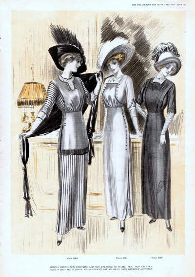
Here, with information taken from the September 1911 issue of the Delineator magazine,  is a list of five of the popular fashion trends that year - all illustrations and text excerpts come from that issue.

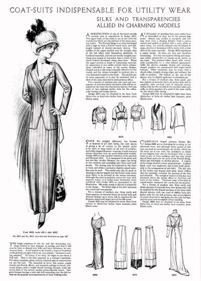
1. Coat-Suits are Indispensable

Five fashion trends from 1911

You can see an example of a typical suit coat in the illustration above, on the left of the page.

“A red branch in the woods, a trace of hoarfrost on the ground, are signs which say very plainly, “Autumn is coming, prepare!” Of course, if we obey, we begin to see about a Fall suit. That is the first essential in a woman’s wardrobe. For many occasions, plain, strictly-tailored ones of conservative cut are the best. The materials in favor this season, rough tweeds and Scotch effects, and mannish suitings in broad, low-toned stripes, with a bright thread running through, make the severe lines of the newest models extraordinarily smart.”

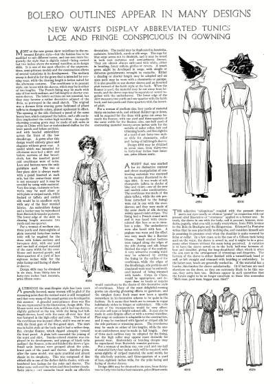
2. Bolero Outlines Appear in Many Designs

Five fashion trends from 1911As waistlines became higher, cropped bolero jackets were a good fashion match. An example of a bolero is seen in the center illustration on the above page.

“Most of the new gowns show waistlines in the extremest Empire style – but the fashion has to be modified to suit different tastes, and one sees more frequently the style that is slightly raised – being carried but two inches above the normal waistline, as in design 4924. .. The bolero sections are not essential, but they may become a rather decorative adjunct of the dress, as portrayed in the small sketch… The opening at the side disclosed a panel of the same heavy lace, which composed the bolero, and a silk cordeliere emphasized the rather high waistline.”

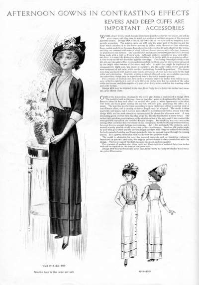
3. Revers and Deep Cuffs are Important Accessories

Five fashion trends from 1911

“Revers” was not a fashion term I was familiar with, so I looked for a definition. Wikipedia defines it as: “A revers or rever is a garment or part of a garment that is reversed to display the lining or facing outside.” Here, that can refer to the lapel and cuffs, as seen in the larger illustration in the page above.

“Wide, drapy revers, which became immensely popular earlier in the season, are still in great vogue, and they may be noted in a variety of outlines on many of the smartest Autumn models. Design 4918 is one of the variations of the style and its simplicity is especially attractive… Some models made from the same design have long sleeves that fit quite closely at the wrists, and they are trimmed with rows of small buttons; shorter sleeves with cuffs may, however, be preferred to the former.”

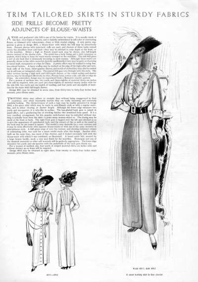
4. Trim Tailored Skirts in Sturdy Fabrics

Five fashion trends from 1911

“Trotting skirts may adhere to straight lines without being exaggerated in their scantiness, and when reasonably narrow they are really becoming and extremely youthful looking. The distinctiveness of such a type may be readily perceived in design 1912, a five-piece skirt which may be made in semi-Empire style or with a regular waistline, and in either clearing or shorter length. Although the lower edge measures two yards and one-quarter, it is tube-like in outline. The box-plaited back gore is joined in panel effect, and a graduating line of stitching finishes this simulated loose panel. It is a very excellent arrangement, for this popular style-feature may be embodied without making it actually loose from the skirt – a point many woman object to.”

5. Large Quantities of Buttons

Five fashion trends from 1911

You can see a definite example of the “button” trend in the center outfit above.

“…Or if buttons are used elsewhere on the dress, as they are extremely likely to be this season, they serve here [sleeves] too. Buttons appear in such quantities that the future ought to be no longer uncertain to those who remember ‘Rich man, poor man, beggar man, thief!’”

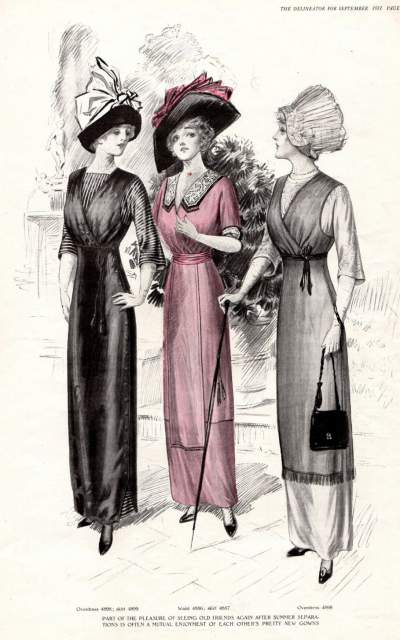
I also leave you with one final illustration from this issue, in which you will notice the revers and the higher waists, as well as some very ornate hats – which although they weren’t mentioned here, are always obvious in fashion sketches from this time.

Five fashion trends from 1911

{ 0 comments }