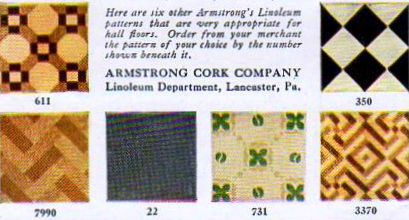
“Here are six other Armstrong’s Linoleum pattens that are very appropriate for hall floors. Order from your merchant the pattern of your choice by the number shown beneath it.”
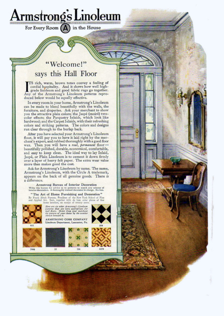
“Welcome!” says this Hall Floor. Its rich, warm, brown tones convey a feeling of cordial hospitality. And it shows how well high-grade linoleum and good fabric rugs go together. Any of the Armstrong’s Linoleum patterns reproduced below would be equally effective.
I love everything about this Armstrong’s Linoleum ad from 1919. The huge hallway has a rich, welcoming look to it. The furniture and decor is formal, let still airy and spacious. And the illustration itself is gorgeous. As soon as I turned to the ad, the black and white pattern choice jumped out at me. It seems that in the late teens, black and white strips and/or squares were popular in both decor and clothing, and it’s one of my favorite styles of all.
And am I the only one who hates seeing an offer for a brochure in a vintage ad I particularly like? For instance, this is what is being offered here to readers:
“The Art of Home Furnishing and Decoration” By Frank Alvah Parsons, President of the New York School of Fine and Applied Art. Sent, together with de luxe color plates of fine home interiors, on receipt of twenty cents.”
I have been known to hunt down some of these especially tempting booklets on ebay or elsewhere online, and I have a feeling this would be a really good one.


{ 0 comments… add one }