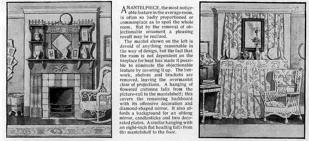
“A Mantelpiece, the most noticeable feature in the average room, is often so badly proportioned or commonplace as to spoil the whole room. But by the removal of objectionable ornament a pleasing result may be realized.”
So states the September 1909 issue of Ladies’ Home Journal magazine, in a short little home decor article entitled “What to do with Ugly Fireplaces” by Ekin Wallick, full of wonderful vintage illustrations of ugly vs attractive mantel pieces.
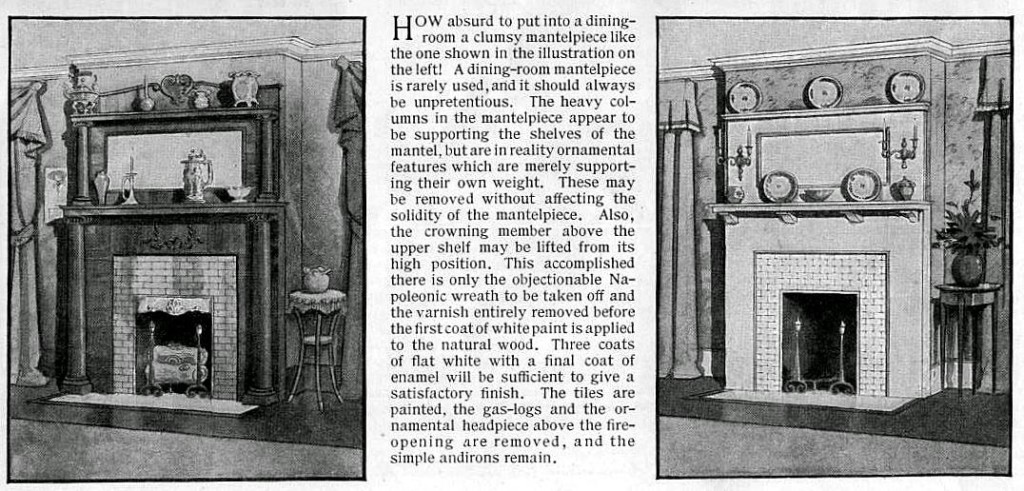
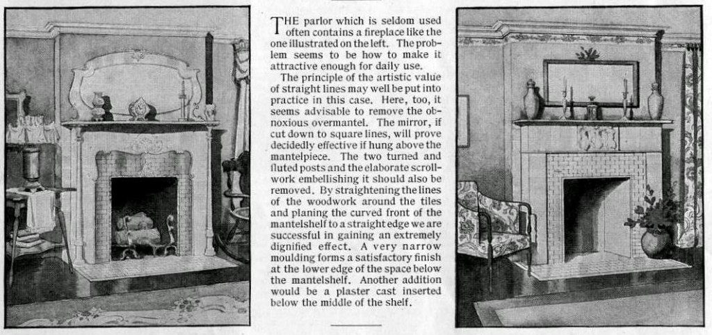
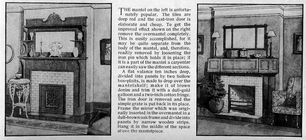
There are four pairs of fireplaces provided here, and the ugly on is always on the left. The “improved” version on the right is the result of taking away unnecessary aspects of the mantel piece and even sometimes disguising it completely. Please be sure to click on each image to enlarge it, because the text that accompanies each one is definitely worth reading. The funny part is that I often prefer the version that the magazine absolutely hates! For instance, the first image set I am presenting here.
The writer explains,
“The mantel shown on the left is devoid of anything reasonable in the way of design, but the fact that the room is not dependent on the fireplace for heat has made it possible to eliminate the objectionable feature by covering it up.”
I actually liked the one on the left a lot, but for some reason it is completely offensive to the author. And I’m really not a fan of the yards of heavy fabric on the right. But I still really enjoyed reading through this article and admiring the illustrations. If you have an old home and are looking for some way to decorate your fireplace in an authentic vintage style, this is the perfect article for you to study!
Now I present to you the remaining three sets.


{ 0 comments… add one }