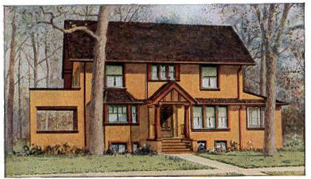
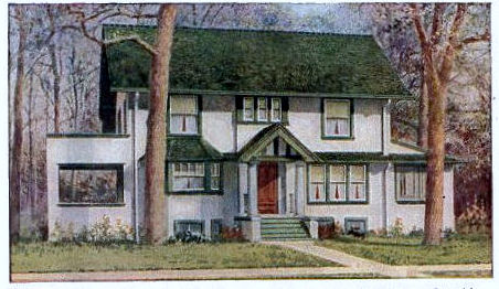
Does one of these houses look better than the other to you? Do you prefer the mustard color or the white?
Well, the April 1912 issue of the Ladies’ Home Journal held a definite opinion. The mustardy-yellow one was hideous! Here are the exact words from the article for the golden colored home:
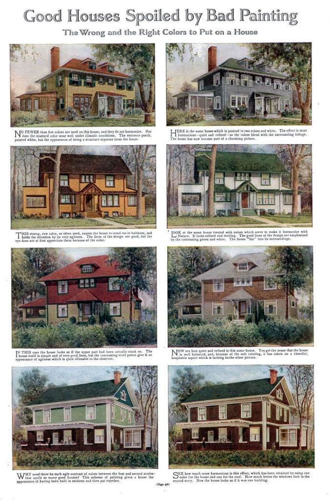
“This strong, raw color, so often used, causes the house to stand out in baldness, and holds the attention by its very ugliness. The lines of the design are good, but the eye does not at first appreciate them because of the color.”
Meanwhile, they couldn’t say enough good things about the white one:
“Look at the same house treated with colors which serve to make it harmonize with Nature. It looks refined and inviting. The good lines of the design are emphasized by the contrasting green and white. The house “fits” into its surroundings.”
Like a lot of vintage “good/bad” example articles in antique issues of the Ladies’ Home Journal (see here for example), the bad examples are on the left and the good on the right. Please be sure to read the text that goes with the pictures in the complete article below, and compare how your opinion fits in with those of the writer!


{ 0 comments… add one }