Men’s Suits by Mail Order, 1905

Men's Suits 1905

One of the items in my collection that I treasure is this 1905 mail order advertising booklet for men’s suits.

Produced by the “Regen Woolen Mills Company” out of Atlanta, the booklet features great illustrations of their men’s sartorial offerings, as well as actual samples of the fabric used to make the suits! The little squares of fabric are taped right in to the pages and you can still feel their texture and see the actual threads. There are about 8 different fabric samples in the booklet, and customers were encouraged to make two choices of fabric:

“While we carry a large stock of woolens at all times, sometimes we run out of a pattern and if you have made a second choice there will be no delay, as we will know just what you want.”

I’ve included a scan here of one of the pages.

Fabric Samples, 1905

Here are a couple of illustrations of the suits they had on offer. According to the text, their single breasted suit is “the most popular garment and the most becoming style to the average man.”

Double Breasted Suit, 1905

Single Breasted Suit, 1905

Finally, here are some pages demonstrating the way their suits are constructed, as well as a page showing how to order. I especially love how emphatic they are about the customer not having to worry about sending them money. One such statement is, “it is absolutely impossible for you to lose a cent in placing an order with us. You take no risk whatever.” However, there are at least three other versions of this idea with varying wording.

The inside making of our suits

How to Order

{ 0 comments }

Mid-Century Living and Dining Rooms, 1958

Living Room, 1958

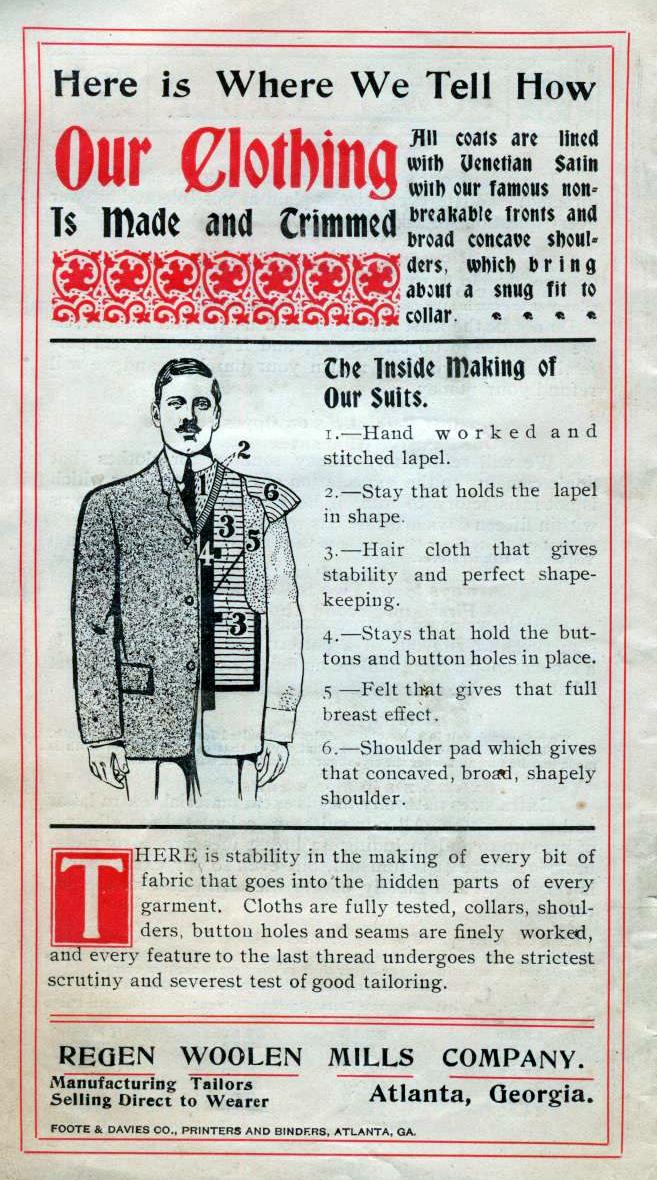
The pictures in this entry are from a great little booklet called the “Sherwin-Williams Home Decorator and How-to-Paint Book” from 1958. This book is full of great mid-century color and style in all its vintage glory!

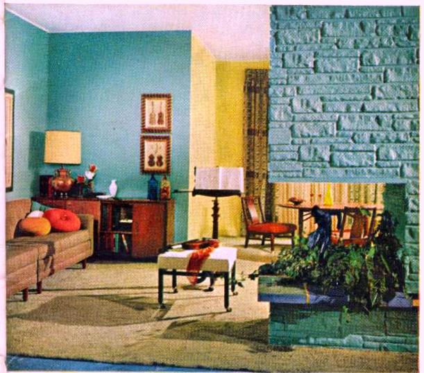
The photo with the turquoise fireplace and walls is actually a view of the living room and dining room together. The booklet states,

“One harmony, two different rooms. The turquoise in the living room is picked up in the draperies, just as yellow in the dining area matches the accessories. “

I love the brightness of these two rooms and it would be pretty easy to replicate this idea in a more modern room. As always, I start by turning to my secret weapon source for paint color (okay, hardly a secret), the Sherwin Williams website that has a whole section full of historical paint colors for sale today.

Here is the “suburban modern” brochure, which sure enough offers a paint color called Holiday Turquoise, a surprisingly close match to what is pictured in the room here (and in fact, this is the exact name of the Sherwin-Williams paint in the book, which leads me to believe it is probably the same one!) The dining room walls seem to me to be closer to the chartreuse rather than the sunbeam yellow, but it’s a close call and you may prefer one or the other. The paint color in the 1958 book is called “citron” which does normally have a hint of green. Either way, these colors are all obviously pretty typical for the 1950′s and if you are looking for that mid-century retro fill in your room, these would be the perfect colors to start with.

Next step is just to round up a bunch of sunny yellow accessories of your own to add some contrast to the room! Just as in the picture, I’d start with a lamp. Yellow throw pillows, again trending more towards the chartreuse end of the scale, yellow area rugs, and wall art are great little choices for adding the yellow accents this room needs. Then just find a few orange accents for a contrasting touch.

Finally, for the dining room, you want to look for some curtains that carry over the turquoise right into this room. Try to find any matching curtains with a pattern decorating them, rather than a solid turquoise which would probably be too much.

Family Room, 1958

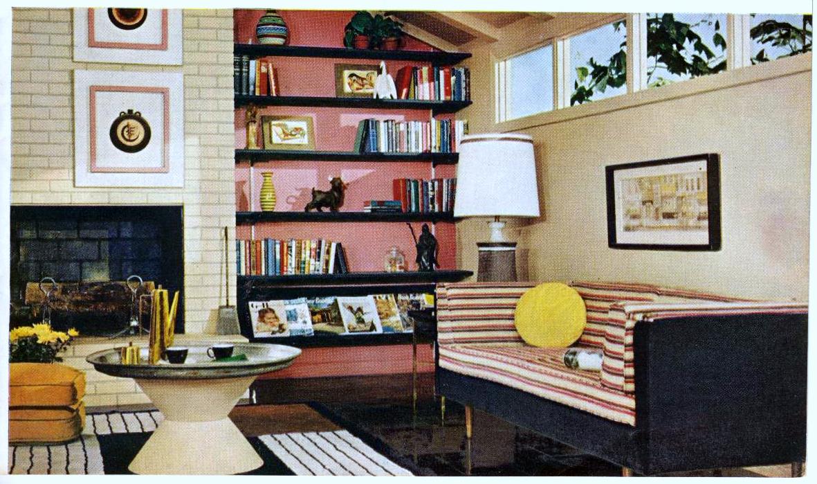
As you can see, it’s not hard at all to add a great mid-century 1950′s touch to your main rooms. Use these pictures as a guide (I’ve included a couple of other pictures from the 1958 booklet of awesome looking living rooms) – just start with the paint colors, look for similar accent pieces (don’t forget to scour the thrift stores), and go from there. And most importantly, add your own spin on things! This way you’ll end up with an amazing vintage-inspired room that doesn’t just look like an exact textbook copy.

Mid-Century living room, from 1958

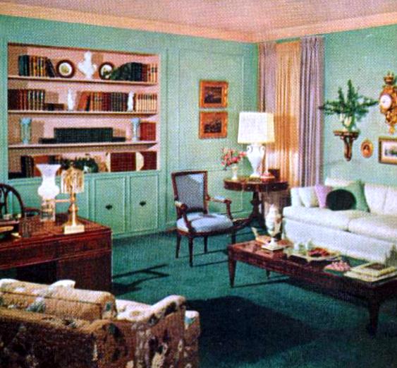
There are plenty more pictures in this booklet; if you’d like to see any particular rooms from the book for inspiration, just let me know and I’d be happy to share them!

{ 0 comments }

Diet for the Thin Woman, 1915

In today’s world, we can sometimes feel surrounded by images of very thin models, and magazine and internet articles full of diet tips to help us lose weight. It is easy to forget that society did not always view weight loss as the final goal that it often is today.

Although I can’t deny that many of my vintage magazines also contain ads for weight loss products and tips, I can’t recall the last time I’ve seen an article such as the one featured here in any modern magazine.

Diet for the Thin Woman, 1915

That’s right, “Diet for the Thin Woman” – in other words, a diet for the woman who feels that she needs to add some pounds to her figure. This fascinating article was found in the November 1915 issue of McCall’s magazine. In the featured picture at the very top of this post, the caption is a bit cut off but it reads “Bread-and-butter and milk make a good bedtime lunch.” The article begins by assuring the thin woman:

Do you, perhaps, as the scales mark one hundred and one, or one hundred and three, or one hundred and eight, make a somewhat similar remark, the burden of which is always that “there is absolutely no use in trying?” If you do, you’re all wrong, for anybody, whatever her heritage or ancestry, can acquire just as many pounds of flesh as she desires, and curves instead of angles, if she only wants to hard enough.

A 1915 how-to guide for gaining weight

But lest you believe that this would be the best diet ever, basically consisting of eating as many sweet, fattening foods as often as you’d like, the fact is that this diet too comes with a set of rules. And not all of them sound very enjoyable. I’ve taken the basic rules of the “diet for the thin woman” as found in this article and compiled them in a list here:

1) Chew every mouthful of food until it is liquid before swallowing it – the stomach will then have no trouble in digesting it

2) Drink eight to ten glasses of water daily

3) Take enough exercise to stimulate healthy activity on the part of every organ of your body.

4) Starchy foods, fats, and sweets build fat.

5) For dinner, do not have too many kinds of food at one meal.

6) Do not eat between meals

7) Have a glass of milk and a slice of bread and butter at bedtime

8) Take a tablespoonful of olive oil after each meal (it is a simple way of taking fats into the system)

"Trying the potato route to extra pounds"

“Trying the potato route to extra pounds”

And finally, at the end of the article comes a special diet for the woman who wants a quick road to gaining weight. She is warned, however, that she will have to avoid the enjoyments of the table. To me this diet sounds like it is in much the same vein as the lemon detox diet of today where someone drinks only lemon juice with cayenne pepper for a period of days to lose a large amount of weight.

“The milk diet – which means milk only, with no solid food, for one month or two – will add from one to three pounds in weight weekly, clear the complexion, improve the health, and develop the figure.”

I truly cannot even think too long about how it would feel to consume nothing but milk for up to two months at a stretch! But I do find it interesting that even though a woman may be aiming for different physical results, in the end there were also women in 1915 still willing to suffer through a rigid diet in order to better conform to the day’s standards of beauty.

{ 0 comments }

Methods of Measuring for Patterns, 1904

Measuring for Patterns, 1904

This handy guide from the October 1904 issue of the Delineator magazine can tell you everything you ever needed to know about measuring for clothing patterns.

The only problem is, these measurements were provided based on Edwardian bodies, and in the case of Edwardian women at least, those bodies usually wore a corset. I had to remind myself of that fact after the shock wore off of seeing the tiny waist measurements provided here for women’s sizes small, medium, and large!

However, I found this chart fascinating and thorough for its explanation of basic measuring techniques. “In taking Measures, always draw the Tape closely – but not too tight,” it instructs the reader. This chart provides guidance on the “Proportionate bust, waist and hip measures” for women, “Proportionate ages and measures of misses, girls, and children”, “Head measure or hat size”, and “Ages and Measures for Boys”. In an era where most clothing was handmade, often at home, and where fashion magazines were full of illustrations for dresses you had to buy patterns for, it was more of a necessity for a woman to be familiar with taking measurements.

Measuring for Patterns, 1904

Finally, above all else, I love the charming little illustrations that are scattered throughout this page!

{ 0 comments }

Jazz Age Bathroom Decor, 1929

1929 Bathroom

I was flipping through pages in the June 1929 issue of the Women’s Home Companion, a vintage magazine I had just received, and was about to put it down when I found this gorgeous color illustration on the inside back cover.

It completely stopped me in my tracks. This had to be the most wonderful bathroom I had ever seen! The colors are rich and beautiful, and everything about it says opulence to me without ever being too much. Immediately I had to find out more.

To start, I noticed that the ad was for the Standard Sanitary Manufacturing Co, Pittsburgh. (Originally from Pittsburgh, I have to admit to feeling a bit of hometown pride upon seeing this.) I read the advertising copy on the page and learned that the Standard company had created plumbing and bathroom fixtures in a wide variety of vivid, 1920′s colors, all inspired by artists.

At this point, I was ready to run out and stalk antique stores and ebay sellers until I found some vintage pieces that would help me replicate a room just like this one. So when I learned that the company had made a book available, full of pictures just like this one as well as all the information you could ever need to decorate such a room, you can only imagine my determination to find myself a copy. Seriously, just read a bit about this book:

“But it was not enough to create beautiful colors. Colors must be used correctly lest they lose much of their charm. And again the hand of the artist is plain on every page of the book ‘Color and Style in Bathroom Furnishing and Decoration,’ pointing the way to greater bathroom beauty (and greater utility) through architectural design, through a better use of materials old and new, through the harmonious use of color.”

An ad for a 1929 art deco bathroom

“Words are not used to decribe colors in this book. The bathrooms are lithographed in all the colors of the artist’s original design. Each reproduction is supplemented by a chart which gives the correct color for the walls, ceiling, floor, floor covering, furniture, and draperies. Thus the book is invaluable as a color guide in bathroom decoration because it is authoritative.”

It seems like this book would be such an immense help for anyone trying to recreate a bit of jazz age decor in their own home. Well, good news: I found a scanned copy of the book online, available for any of us to view! Simply go to this page at the Hagley Digital Archives, and there you have it, your own online copy of “Color and Style in Bathroom Furnishing and Decoration.” And the pictures inside are every bit as lush and beautiful as I had been hoping. If you are interested in 1920′s style home decor, I’m sure it would be worth your time to look over – there are color samples, examples of rooms, and illustrations on which to model your own decor.

{ 0 comments }

Waterman’s Ideal Fountain Pen

Waterman Ideal Fountain Pens, 1907

Waterman Ideal Fountain Pens, 1907

If you spend much time at all looking at vintage magazines from the early 1900′s, one thing you will definitely notice is the quantity of ads for Waterman’s Ideal Fountain Pens.

Fountain pens were used by almost everyone; there were special models designed for students, for women, and for men. In the ad I have posted above, you can see seven different options for the Ideal pen.

Waterman's Ideal Fountain Pen, 1909

Waterman’s Ideal Fountain Pen, 1909

I was curious about the line in the ad above that states, “The day of fountain pen jibes and jokes has passed.” I couldn’t figure out why they would joke about fountain pens! But I looked around a bit online, and the best explanation I was able to find was on Kamakura Pen’s Fountain Pen Humor. From that web page is this old joke:

Mrs. Spriggs: Why do you leave such horrid ink blots in the letter to Mr. Kimble, when you are asking him for position in his company?

Mr. Spriggs: I wanted him to see that I am enough of a businessman to use a fountain pen.
-Fort Wayne Sentinel June 21, 1890

So it seems that early fountain pens were quite prone to leakage and blotting, but by the time of these ads between 1907-1909, they had greatly improved and their use was no longer something to be mocked.

Waterman's Ideal Fountain Pen, 1908

Waterman’s Ideal Fountain Pen, 1908

My husband actually has an old, golden version of the Waterman’s Ideal, so these really did seem to survive well and continue to be used today. I couldn’t find many actual photo of this pen online, but this website has a current photo of a 1907 Waterman Ideal that you can click on to enlarge.

{ 0 comments }

La Mode, vintage French fashion magazine

La Mode magazine 1922

La Mode, vintage magazine of French Fashion, 1922


Continuing the French theme from my last post, I turn now to La Mode.

La Mode is a charming little French magazine from the 1920′s; this issue from May 1922 is now very brittle and every time I open it I am afraid I’m going to tear the fragile pages. The pages are so thin that the ink from illustrations on the back of each page bleed through the text on the front. Yet the magazine is exquisite. I can almost hear vintage French piano music playing as I gaze at the ads and the drawings.

Above is the colorful front cover, featuring one of the longer dresses of the early 1920′s. I am also sharing some other great excerpts from this issue of La Mode: dressmaking patterns, a fashion plate, and an embroidery pattern. I hope you enjoy this little glimpse into vintage French fashion as much as I do.

French pattern, 1922

French pattern, 1922

Vintage French Fashion, 1922

Vintage French Fashion, 1922

Vintage French Embroidery

Vintage French Embroidery

{ 0 comments }

Like it French? Recipes Adorable by Renee Adoree

The July 14, 1930 issue of “Broadway and Hollywood Movies” magazine contained a charming article featuring silent film and talking pictures star Renee Adoree.  

As the article states, she was born in Lille, France, and so the magazine requested her to present some of her favorite French recipes to its audience.

Renee Adoree

Renee Adoree


Renee Adoree was born Jeanne de la Fonte in 1898, so she was 31 at the time of this article. The sad truth is that she would be dead only three years later, a victim of tuberculosis. I first became aware of her as the female lead in The Big Parade, a 1925 silent movie about World War I, which she starred in with John Gilbert. It’s a long movie but it’s so good I’ve watched it several times already and I’m sure I’ll watch it again!

But now let’s turn to what the magazine claims to be Renee’s own words here in 1930. She begins by asking,

“Do you like real French cooking? Ever been to Paris and tasted the world’s masterpieces of the culinary art? Ever sample a real pleasant meal in the province of Burgundy or tasted a rare onion soup in Brittany? If not, you’ve missed a lot in life.

“Of course, climate has much to do with the tastes cutivated by your palates and the needs your body feels by way of nourishment, but voila!, that is true all over the world. It will interest some of my readers to know that France is about on the same latitude as Labrador. That means longer days in the summer time than you have in New York or Hollywood, and longer nights in the winter…. Which is as it should be.”

The lovely Renee goes on to present the following French recipes, with the disclaimer that: “I’m not going to attempt to give you a meal nor lay out a menu to stick by, –just a few of my favorite recipes I have used in America”:

1) Lille Chocolate Delicacy
2) French Frozen Pudding
3) French Fried Deviled Eggs
4) Pate de Fois Gras
5) French Dressing a la Renee
6) French Fried Mushrooms
7) French Fried Chicken

I have included scans of the complete article, so if you would like to try any of the recipes you can just click on the images and you’ll be able to read through them. There seems to be a lot of frying involved, and also very basic ingredients.

In closing, Renee writes,

“Voila! Now you have it. I only wish that I had more space to give you more of these delightful recipes. Possibly later, n’est pas! Until then, au revoir.”

Renee Adoree's French Recipes

Renee Adoree's French Recipes

{ 0 comments }

Children’s Clothes from 1926

Here are some beautiful vintage illustrations of young girls’ clothing from the 1920′s.

Even in children’s attire we find the same clean lines, drop waists, and cloche hats that adult women of the time favored. These fashion sketches are from the October, 1926 issue of McCall’s magazine.

Children's Fashion, 1926

Gold and green dresses for girls, 1926

Young girls' fashion, 1926

Green and red coats for girls, 1926

{ 0 comments }

Electric Appliances in Vintage Advertisements

electric range

1929 Hotpoint Electric Range, “The Electric Maid for Modern Mothers”

As electricity becomes more common in daily life, the ads one finds in magazines are transformed.

While ads in my early twentieth century magazines feature wringers for washing clothes and hand-powered vacuum cleaners, as time goes on we find ads for electric toasters, electric vacuums, and electric washers and dryers.

electric vibrator, 1908

White Cross Electric Vibrator, 1908

In this entry, I am sharing some of my favorite ads for electric appliances that I found in typical vintage magazines such as Good Housekeeping, Women’s Home Companion, and McCall’s. The dates range from 1908 through 1929, and I’ve included the date and item/brand name in the caption under the illustrations.

1923 appliances

1923, Rotarex Apex Electric Vacuum Cleaner, Washer, and Dryer/Ironer

As you read the ads, you will find that a theme you see often is the ability of electricity to save time and to lighten the workload, especially for women. “What’s the value of a woman’s time?” asks the ad for an Apex vacuum cleaner. “The electric maid for modern mothers,” the Hotpoint range bills itself. Electricity could help reduce pain and stiffness (the vibrator), eliminate the need for an attendant worker (the elevator), and successfully and quickly produce exactly the kind of food that you prefer (the toaster and the waffle maker).

Otis elevator, 1908

The Otis Electric Elevator, 1908

In the years after these electrical appliances were introduced and came into popular use, women’s roles in the home began to change. She had more leisure time, and less hired help was needed. Previous ads for non-electric vacuum cleaners, for example, showed the housewife along with a maid and sometimes a child all pitching in to clean a room. Now, the pictures in ads shifted to show a woman alone happily cleaning the floor, or simply sitting in a group of friends enjoying the extra time these inventions have afforded her.

Electric Toaster, 1923

Star-Rite Electric Toaster, 1923

Electric Waffle Iron, 1929

Universal Electric Waffle Iron, 1929

{ 0 comments }